« Home
How to Play
Sep 15
2006
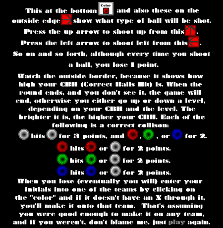
Recently, I came across a posting on the FlashKit forums asking for feedback on a game called Regeb. When I attempted to play the game I was confronted by this instruction screen:

I was finally able to figure out how to play without the aid of the instructions. The game was really not that difficult to understand—quite a bit simpler than one would be led to believe by reading the instructions. I began to wonder why it is so hard to write concise, understandable instructions for a game.
The main obstacle when creating instructions for casual games is the user’s attention span. A person browsing games online seldom has the patience to study a lengthy instruction screen. In such a situation the visitor may choose to just skip the instructions (as I did), resulting in a diminished experience of the game, or he may choose to just skip the game entirely.
Obviously neither of these scenarios is desirable. Too often, however, good games are hindered by poorly designed instructions. The instruction screen should be a quick introduction to the rules of the game, the rest should be made evident through playing the game itself. Game designers often try to pack too much information into the instruction screen, listing enemy types, scoring variations, and so on. Much of this information can be made evident through the game itself.
Another common mistake, as can be seen with the Regeb example above, is choosing to write out the entire instructions for the game in a lengthy paragraph or two. Games are a very visual medium, and so it makes much more sense to show the user how to play in the same visual language as the game itself.
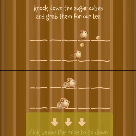
The most effective strategy for teaching a user how to play the game is by showing him not merely telling him. This can be done in different ways, however. Many of the games at Orisinal use a series of short animations to convey the game play mechanics prior to starting the game. This works particularly well with these games since the animations give you an introduction to the adorable characters used in the games, and often the animations themselves are compelling enough to hold the player’s interest.
 (Screenshots from ‘Daily Cup of Tea’ Instructions)
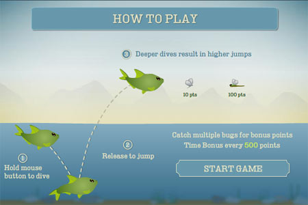
Another approach is to not only introduce the game’s characters and dynamics, but to show them in their environment as well. I like this approach the best, as it gives the user an introduction to the visual information in the game, letting him become acquainted with the game before he actually plays it. This is the technique I chose to use in The Lake:

Here the fish is in the same environment in which he will appear in the actual game. He can be seen frozen in time in the lake. A dotted line shows how the fish will move in reaction to the user’s mouse input. The two types of flies appear, just about to be swallowed, to indicate the dragonfly’s greater value.
A third option is to show an actual game being played. This is the approach currently being used in Regeb. While I think the Regeb demo could benefit from some added information about the game’s controls, the demo does a much better job of conveying the game’s rules than the old instruction screen.
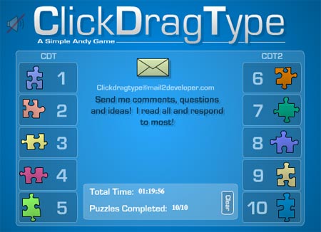
The extreme of minimalist game instructions can be seen in Simple Andy’s fabulous game Click Drag Type. Here the name of the game itself is the only instruction required. No other explanation is given.

This game is a unique case, as the object of game is to solve a series of puzzles by essentially figuring out the missing instructions. Still, I love the idea of a game that you can just start playing with no need for explanation, and this is a wonderful example of that. Click Drag Type is challenging and fun and there are no lengthy instructions to get in the way of playing the game.
- Previous Article:
Perfection - Next Article:
Death to DRM - « Home